
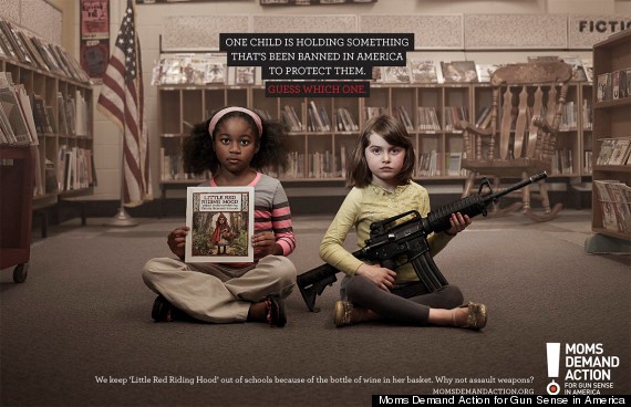
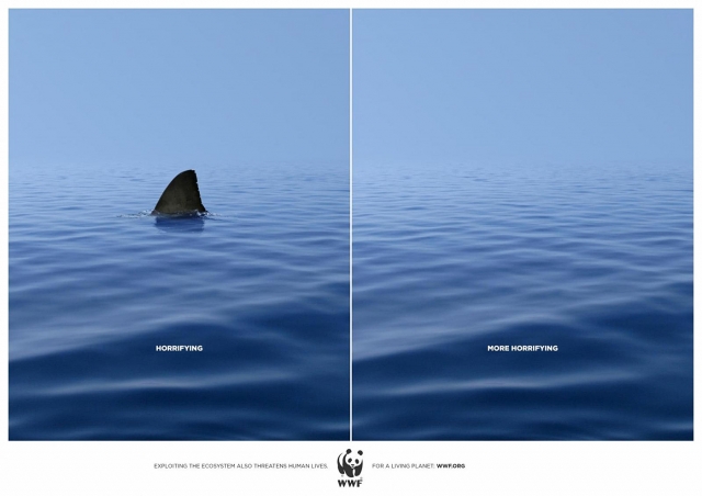
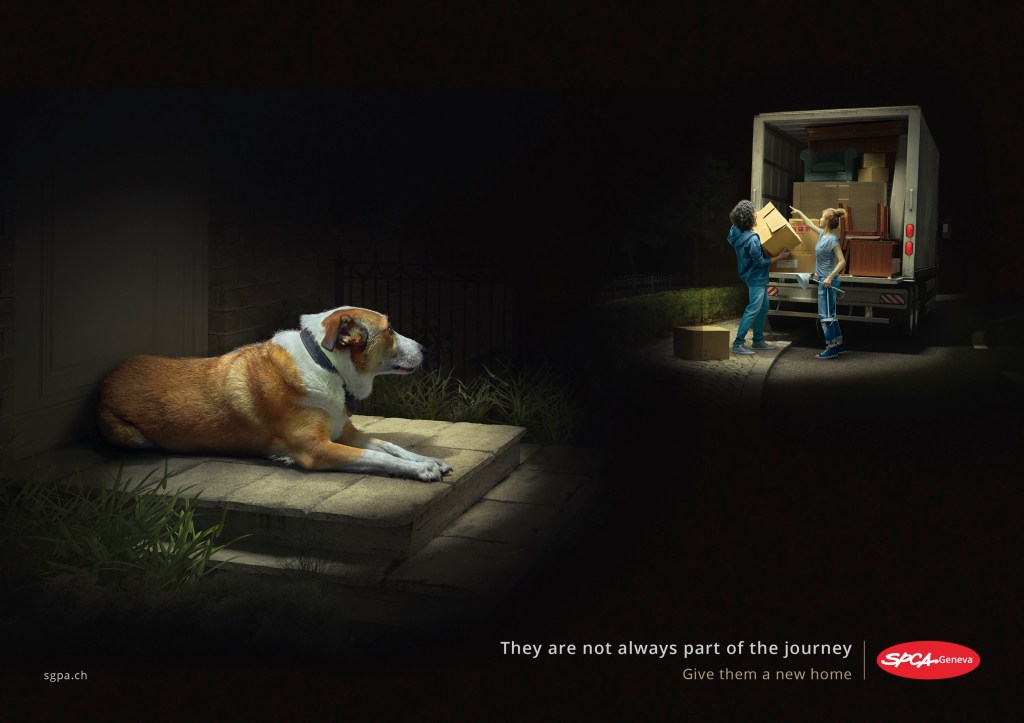
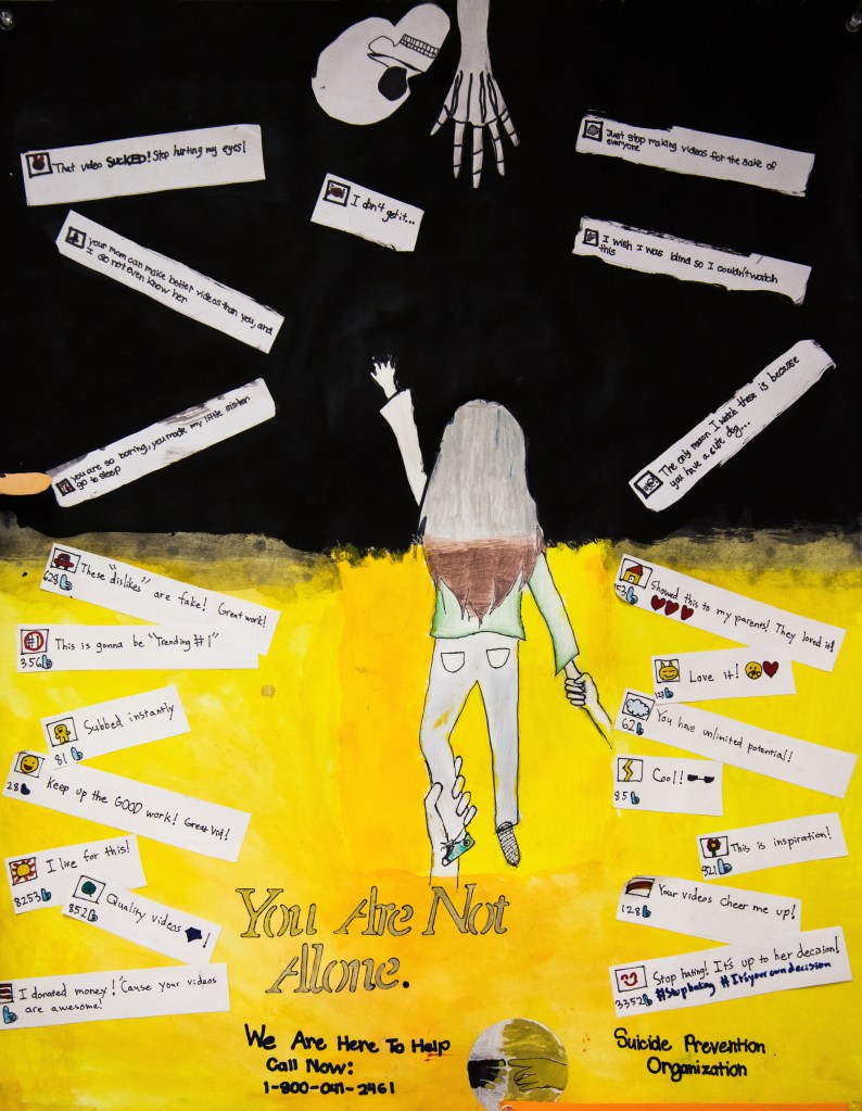
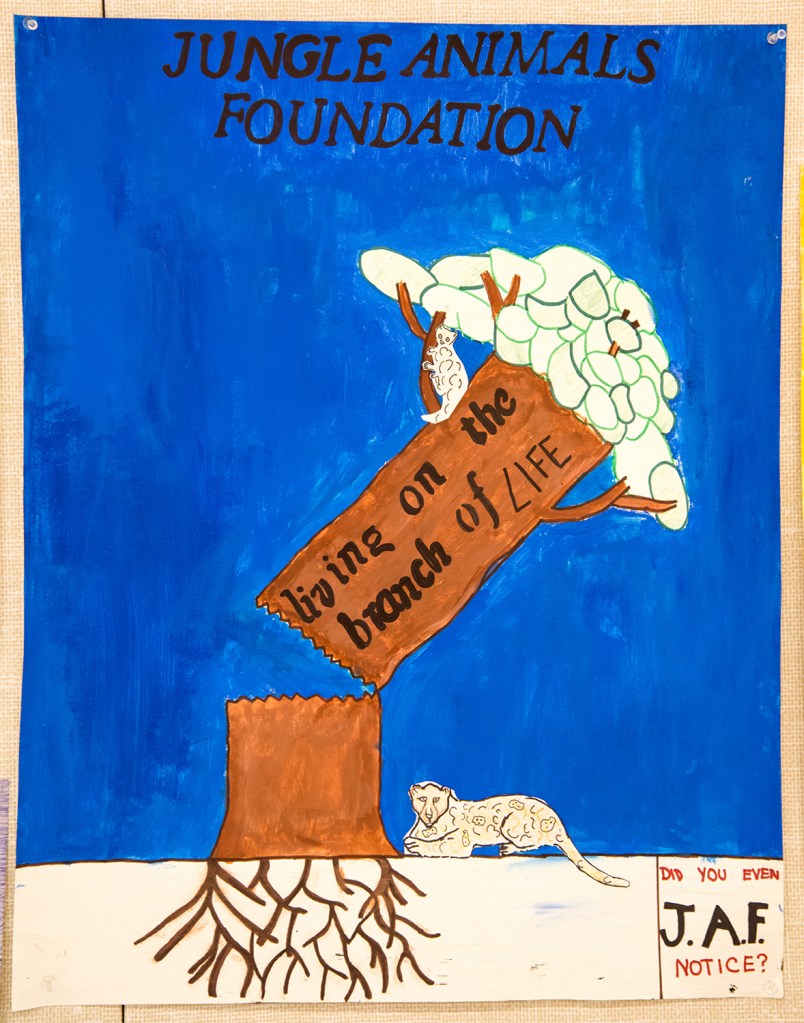
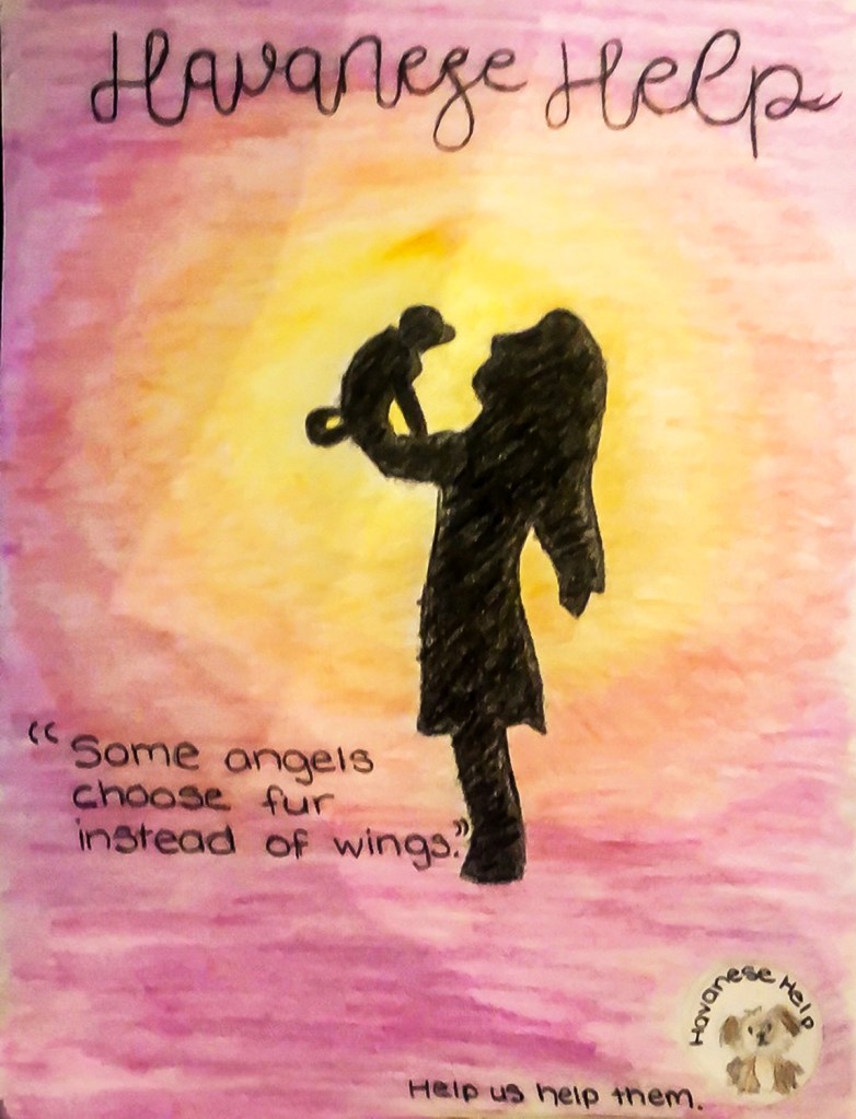
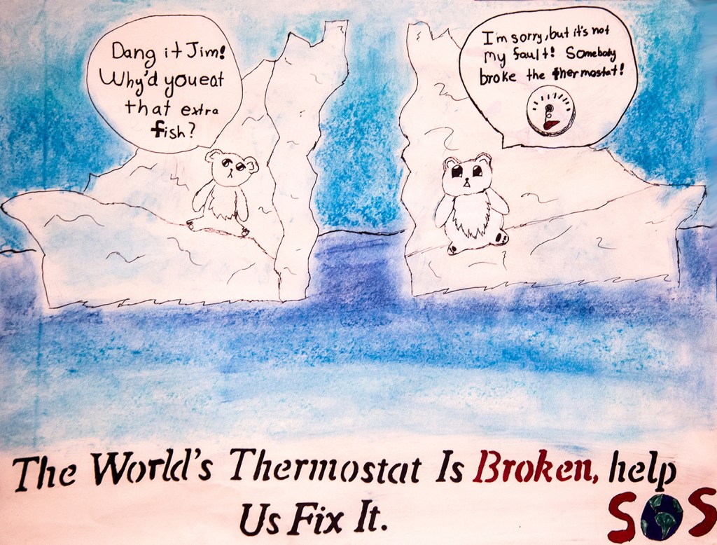
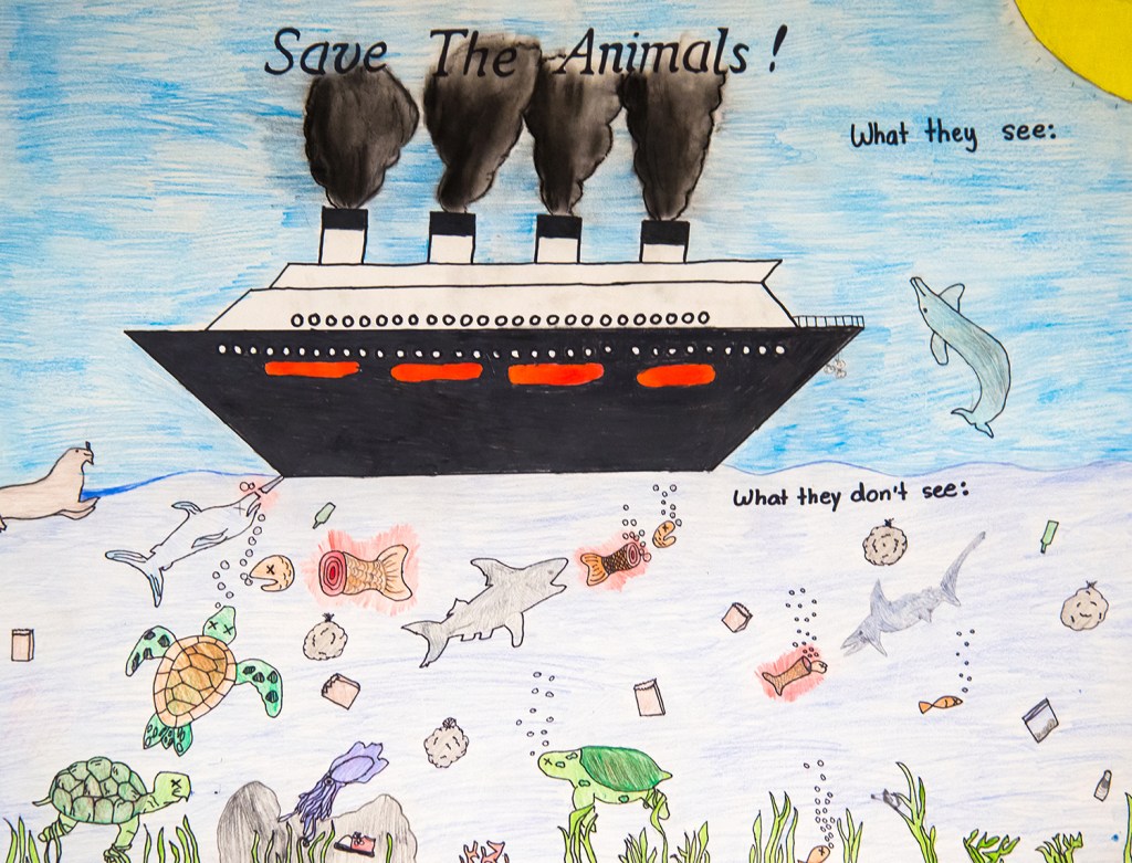
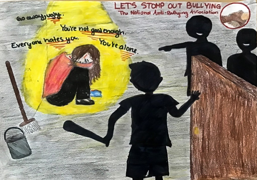
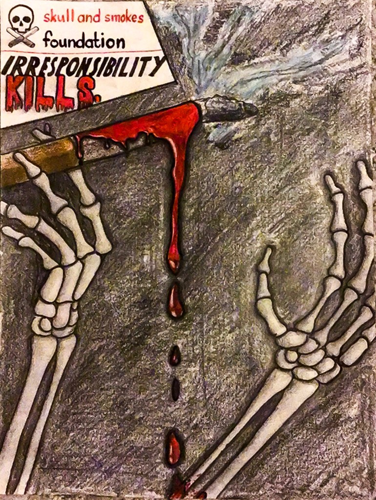
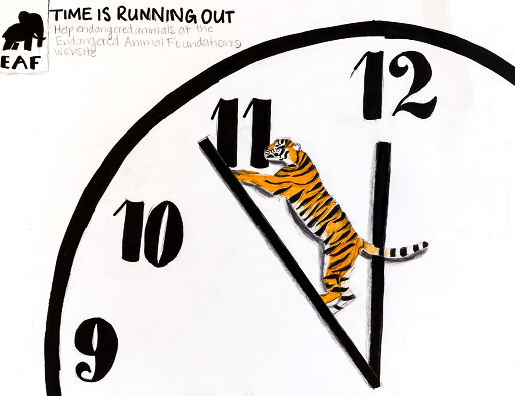
Description of the Unit – Building upon what students learned in 5th grade about product advertisement in print (https://anitasagastegui.com/2020/07/27/5th-grade-print-advertising-and-cultivating-visual-literacy/), students in 6th grade will look at ads from NGO, nonprofit and charitable organizations to examine how imagery and elements of design are used to sway people to a particular cause. It is interesting to go back and look at the 5th grade product advertisements, comparing them to the 6th grade NGO ads. Reinforcing and reviewing what they studied last year has helped to make the nonprofit ads all the more visually dynamic and sophisticated, as you can see. Students will work in groups to create a non-profit organization of their own, complete with mission statement and logo, and one advertisement aimed at convincing viewers to donate or work for their organization’s cause. To test the ads’ effectiveness, we will have a contest between the groups, with faculty, as well as students in 3rd-8th grades voting on the most eye-catching and persuasive ad.
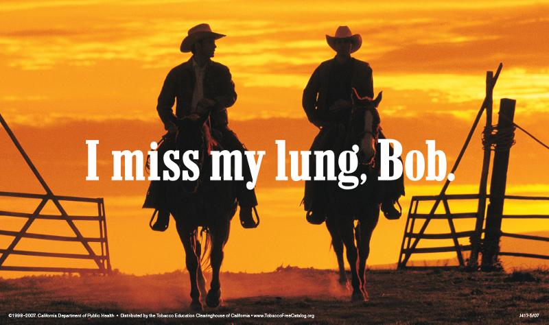
Activity statement – There exist many hundreds of charitable organizations around the world, each trying hard to raise funds and recruit volunteers to fulfill their mission. NGO’s often use ad campaigns as a means of swaying people to their cause. Many of these ads are extremely artistic, clever and fascinating in their own right. In this unit students will explore a variety of NGO ads, using what they have learned of the tactics used in advertising (reinforced form their work on product advertising in 5th grade) to come up with their own charitable organization for which they will create an ad in the hopes of persuading others to their cause.
Students will explore the same strategies as they did last year for product ads, which not only helps them to understand how print advertisement works, but helps them to become visually literate in a world bombarded by advertising and propaganda:
Design Elements
- Does the ad use mostly one isolated color?
- Does it use a simplified color palette? To what effect?
- Does it use contrasting color schemes? To what effect?
- How is the ad composed? Where is the focal point?
- Does the ad use negative space for effect?
- Where does your eye move? Are there leading lines?
- Does it use point-of-view, perspective and scale creatively?

Story/Emotion
- What kind of story is the ad telling? Can you tell what the organization is trying to do, or is it unclear?
- Does it use hyperbole and exaggeration to tell its story?
- Does it use humor?
- Is it trying to elicit a “big” emotion (shock, surprise, horror, laughter, fear, disgust?)

Copy and other visual cues
- Is there any common symbolism?
- Is there a visual metaphor being used?
- Use of pop culture or historical icons and ideas?
- Is the imagery clear and simple?
- Is it showing rather than telling (i.e.: using imagery over text)
- Is the copy (text used in an ad) short and sweet?
- Is the copy interesting to look at?

On working in a group: I like to feature at least two units per year that center around group work. For this particular unit the reason behind making this a group project is to mirror real-life experience. First by coming together with a cause they can all support, and trying to determine what their organization’s name, mission statement and objective is. Then just like at an ad agency, students have to pitch their ideas to the group, with the group choosing that idea which they consider strongest. The same goes for the organization’s logo. This teaches students how to articulate their ideas as well as how to listen to and be open to others’ ideas. Once an idea is chosen, the group then has to delegate tasks, negotiate the process, and compromise. Everyone should have something to contribute. In real life we don’t always get to choose our coworkers, so this is a great learning experience for finding ways to cooperate with one another for a common goal, while not always getting along.
On the contest: This is just a fun way to up the ante for the students. Once the ads are complete, we display them in the multi-purpose room so that the rest of the school—students (from 3rd grade up), admin and faculty—can observe the ads and place their vote in an envelope. On the ballot is written things to look out for, including whether a particular ad is eye-catching, if it holds your interest, and if it persuades you to the ad’s cause.
Goals – Students should…
Understand:
- Various visual mechanisms artists and advertisers use to advertise products (in this case to promote an idea or concept rather than a physical product)
Know:
- How to recognize the inherent “message” in an ad
Be able to:
- Discuss the difference between a literal and a figurative (exaggerated) image
- Create a print ad that uses imagery and symbol to convey an idea and message
Objectives – Students will:
- Explore ways in which artists/advertisers use imagery to persuade viewers to the organization’s cause
- Create an ad (in a group) that tries to catch a viewer’s eye and convince the viewer that they must help their cause
Resources and materials –
- Presentation of various nonprofit ads
- Posterboard, tag or Bristol board (white) in large format
- Pencils
- Erasers
- Sharpies (fine and thick point)
- Rulers
- Watercolor pencils
- Markers
- Oil pastels
- Chalk pastels
Questions – Applies both to viewing other ads and creating their own:
- What is the ad saying?
- How is the ad conveying its message?
- How does the ad catch your eye?
- What colors does the ad use?
- How does the ad use positive and negative space?
- Do you notice any symbolism? Explain.
- Do you notice any visual metaphors? Explain. Is there any coy in this ad? How effective is it? Explain.
- What feelings does the ad spark in you? Is the ad funny? Is it disturbing?
- Is the ad effective—in other words, does it make you want to contribute time or money to the organization? Why or why not?
Evaluation – Did students:
- Understand some of the visual mechanisms involved in print advertising?
- How to look for the message within an ad?
- Understand the use of the metaphoric and exaggeration in print advertising?
- Work with color, shape, line and space to draw the eye to their ad?
- Have a message, or story, within their ad?
Informal:
- Student questions
- Group discussions
- Oral responses to essential questions
- Group-created ad
- Contest results


One thought on “6th Grade – Nonprofit ads and reinforcing visual literacy”